Cannabis testing made easy
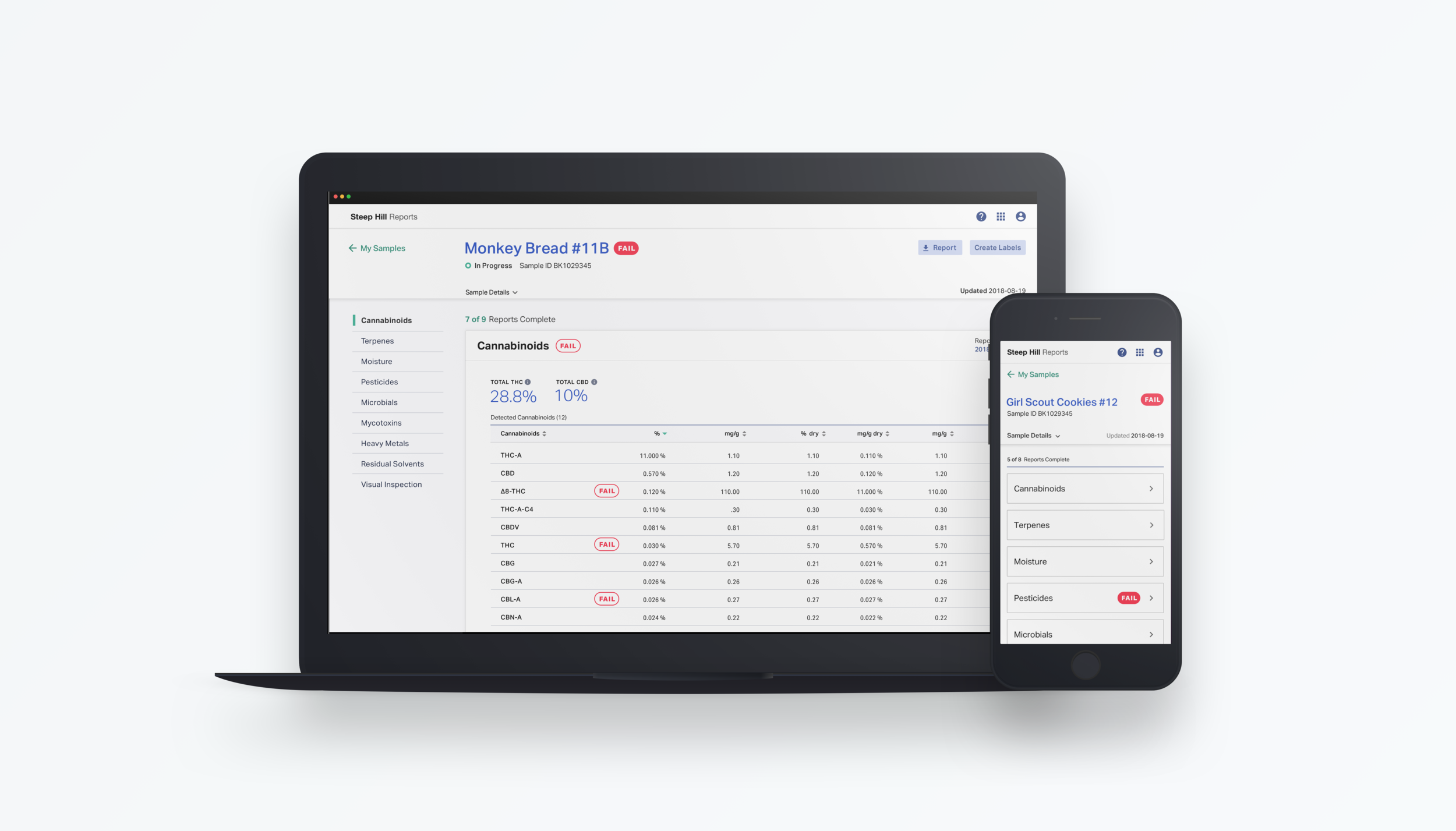
Steep Hill is the global leader in cannabis testing. Farmers, manufacturers, distributors, dispensaries, and end consumers test products with Steep Hill to ensure quality, consistency, and above all, safety. Customers access their test results online through the Steep Hill Reports web application. As I joined Steep Hill, the first version was launched, and I helped to evolve the web application further.
Role
UX/UI
Research
Strategy and Planning
Design Thinking Facilitator
Team
2 Product Designers
4 Engineers
1 Product Owner
Background
Problem
Customers can only view one test result per sample at a time in PDF format. The experience is disjointed, cluttered, cumbersome, and not mobile-friendly.
Goal
With an international customer base and rapidly changing regulations, Steep Hill needs a solution that scales to meet the evolving needs of an up and coming industry. We needed a flexible design that served a variety of users and allowed them to easily access their test results with speed and clarity from anywhere.
Discovery
Key stakeholder interviews
My goal was to have a clear idea of the expectations of the product. I was able to create a shared understanding of what their goals were for the product and unearth misalignment before diving into the project.
Scientist questionnaires
I created an in-depth questionnaire for the Steep Hill scientists. The survey focused on cannabis testing to fully understand the testing process desired results customers are seeking, and any relevant data to display.
User interviews & contextual inquiry
My main goal for these research activities was to get a general understanding of all possible types of users utilizing the product. I interviewed over 20 users and customers ranging from CEOs to Administrators from a range of the kinds of businesses: farmers, manufacturers, dispensaries, and distributors.
Competitive analysis
I looked at our direct competitors, taking into consideration their brand, tonal language, reviews, wait times, features, and a heuristic evaluation of their products when possible. This allowed me to see where our opportunities were to differentiate the product and brand.
Key findings of initial research
Ever-changing qualifications
Customers have to keep up with changing regulations, making them second guess what tests they should be ordering.
A customer doesn't know immediately know if a product meets regulations. When they do find out, they have no explanation as to why unless speaking with a Steep Hill employee.
Not in context of their production needs
Users cannot view the results in units of measurements that fit their needs.
Account Managers find it hard to keep track of samples and where they currently sit in production after receiving a result. They typically create spreadsheets to manage the data they collect from reports.
Overwhelmed with questions
The Customer Experience team is bombarded with emails and phone calls with questions specific to interpreting the reports and statuses of tests.
They spend a lot of time giving individual responses to the same questions over and over.
Hard to collaborate and communicate
Understanding what action to take on a sample is complicated, with limited ways to communicate with other team members.
Complexity
Current reports are complicated and hard for users to understand (most customers lack a scientific background or in-depth understanding of cannabis testing).
Digitized reports
Customers want to be able to access their reports in a digital format to manipulate and share the results.
Static results
Customers cannot view results in units of measurement that fit their individual needs.
Persona

Current service blueprint
My goal was to place the majority of my learnings in a model where people could quickly provide feedback. I worked with the customer service team to provide further detail on information I didn’t get a full picture of from initial interviews.
This allowed the business to define goals and prioritize certain areas that would be most impactful in a tangible way.
Evaluating the previous interface
Lacks clarity
Unclear statuses
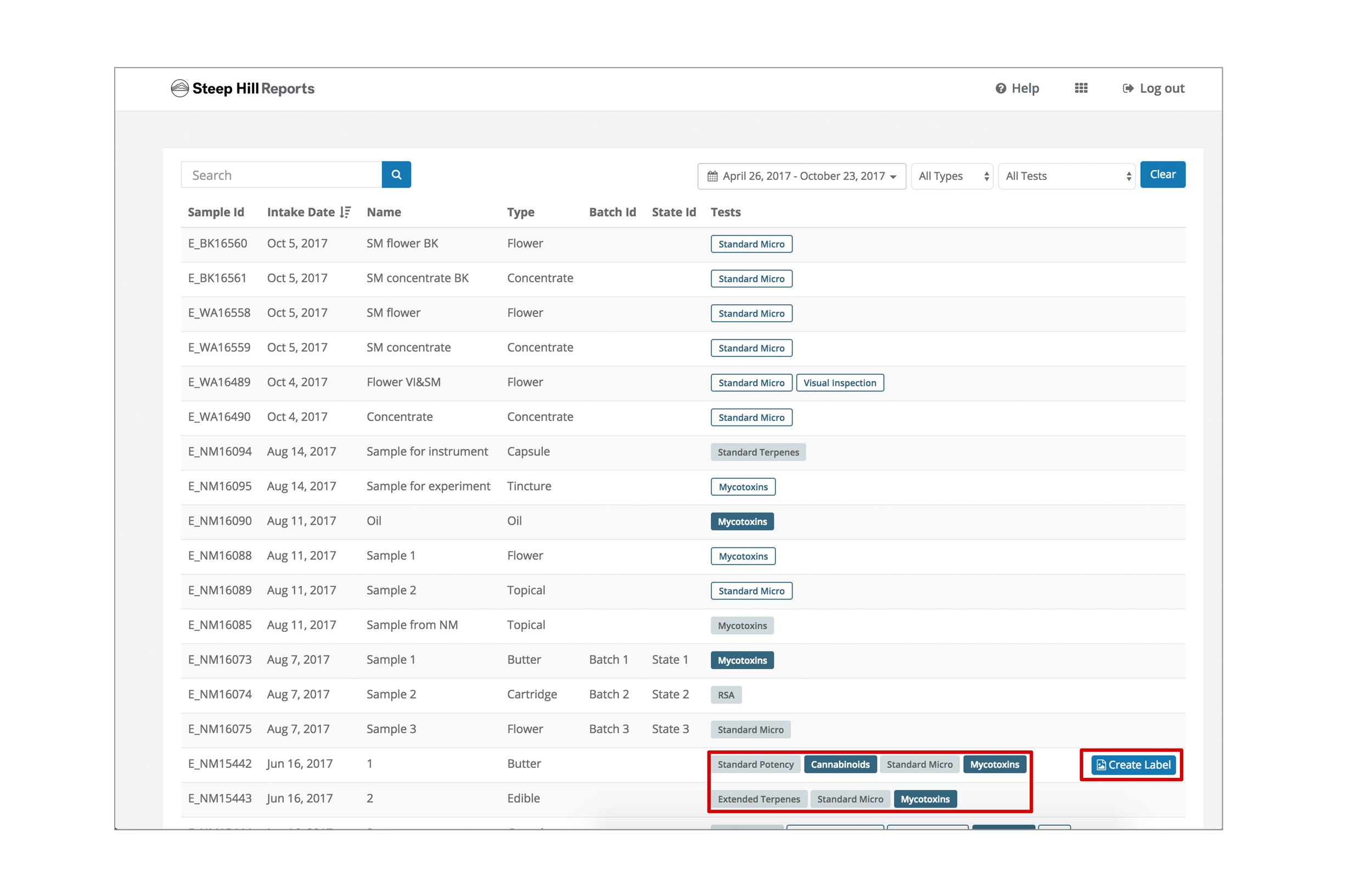
Statuses are provided per test and conveyed through a confusing visual treatment that relies on a hover state. This brings up accessibility concerns and is not mobile-friendly. Only completed tests are clickable, but it’s not clear given the visual treatment.
There are no Pass/fail indicators. Users must know if their product has passed and is market-ready.
Inconsistent action availability
Create label functionality is not always available. Lacks an explanation as to why a user can or cannot create labels.
Cognitive overload
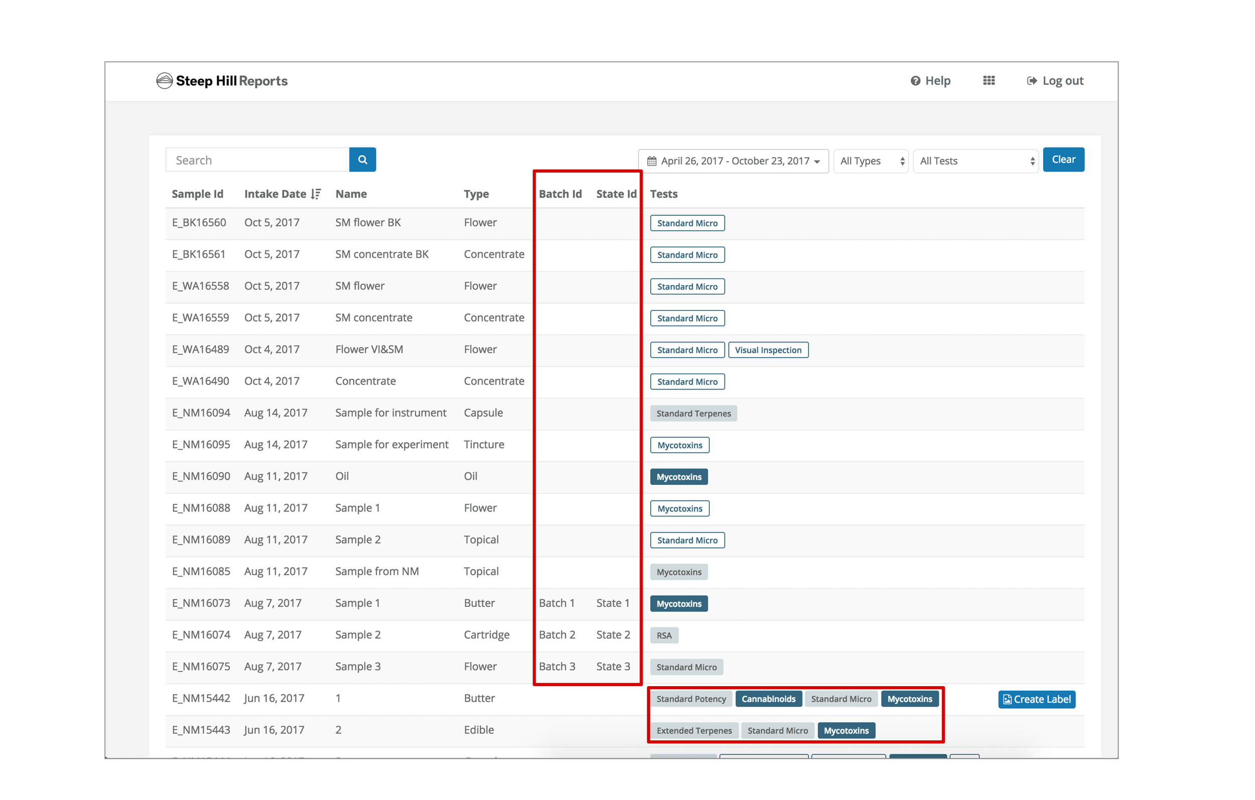
Irrelevant data fields
Data columns serve internal Steep Hill needs rather than user needs. Columns can be eliminated and replaced with useful data for the user.
Disorienting
“Tag” treatment used to convey both a way to access ordered tests and statuses of them. This solution breaks easily on mobile with multiple tests.

Cumbersome
Separated results
Customers need to open and download a Certificate of Analysis (test results) individually in PDF format.
Inflexible
Users need to be able to work with different units of measurements. With static data, users are left making conversions manually and unable to sort the data.

Sketching out ideas
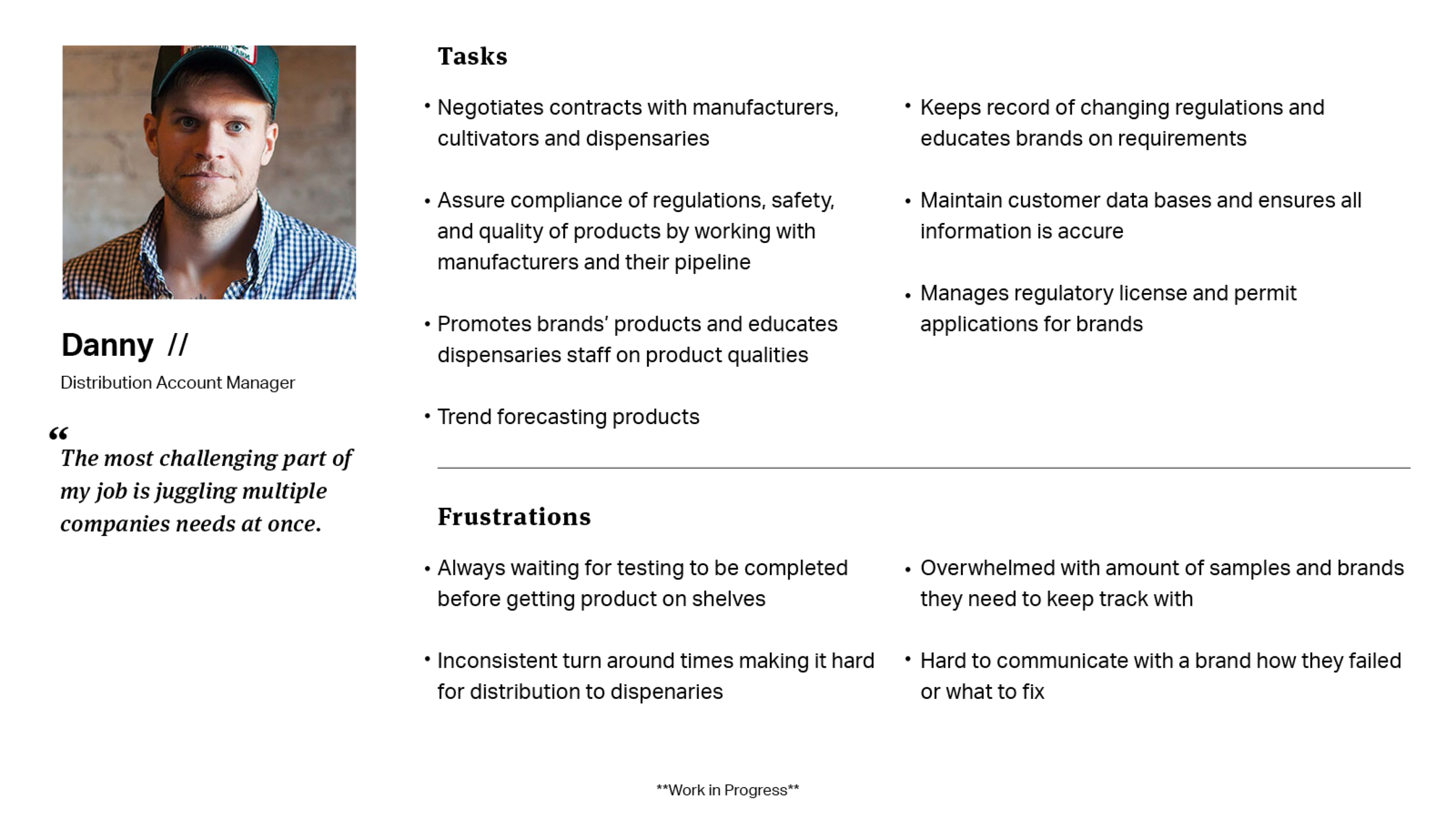
My first objective was to allow for test results to be seen more holistically so that Danny doesn’t need to remember specifics when viewing the results separately. Another aspect I was exploring was providing some upfront data to let Danny skim through samples. As a result, Danny can decide what may be most important for him to view first.
Final wireframes
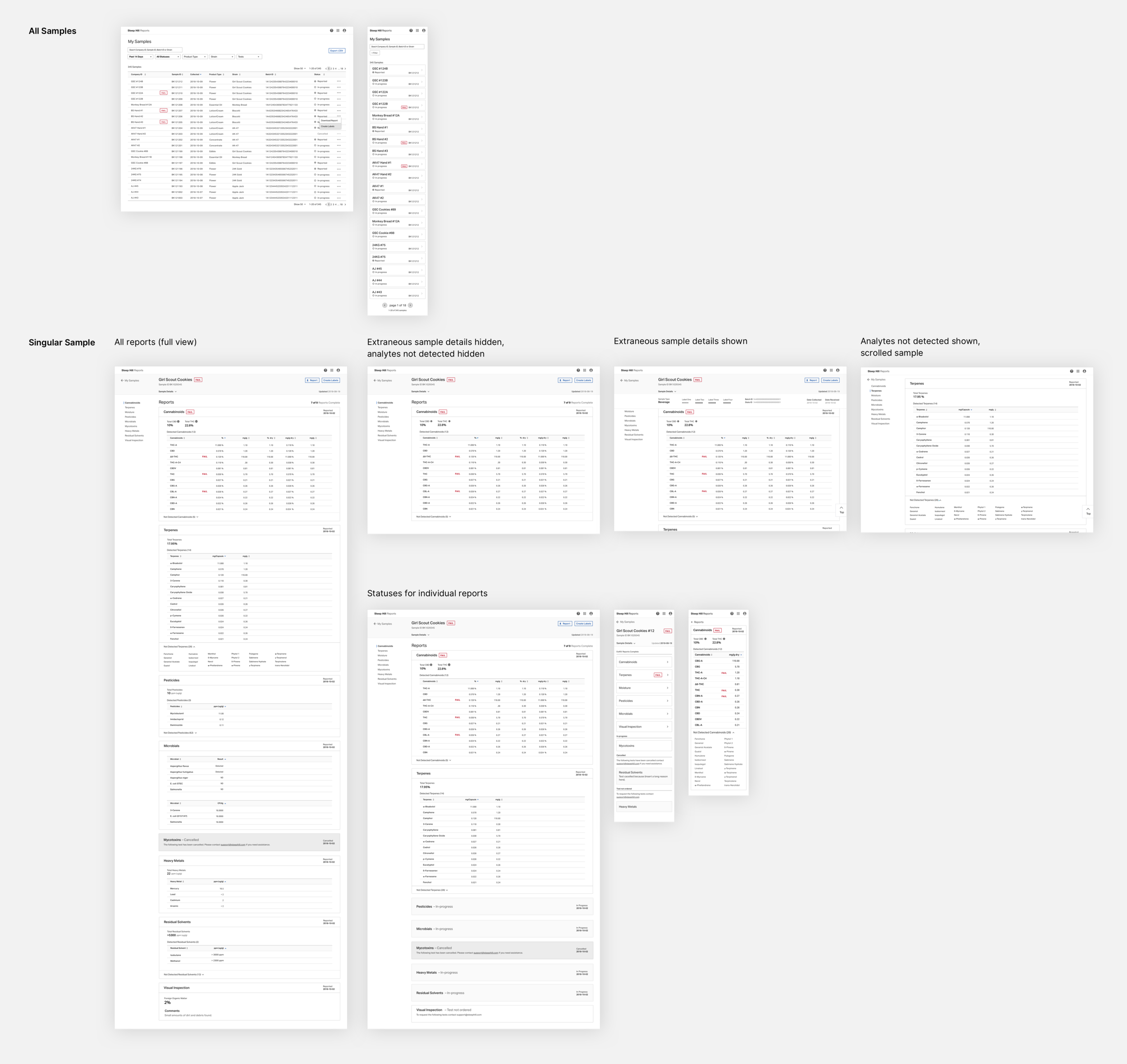
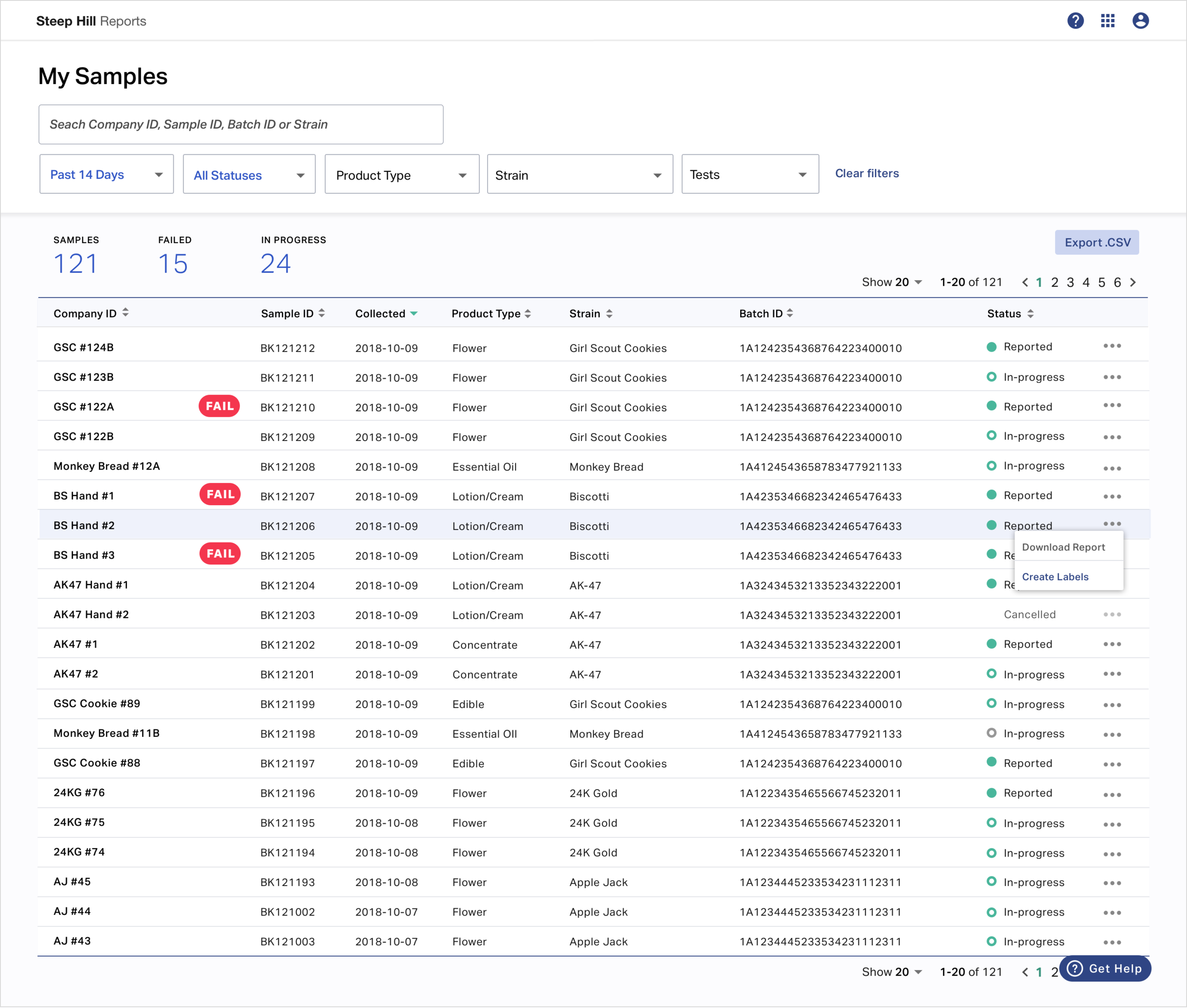
A clean and simple solution
Clear statuses
Users can quickly see the status of their samples with both visual and text treatment. Since the status is per sample now, there is a significant reduction in visual clutter. Users also know exactly where they stand with each sample.
Pass/fail indicators
Pass/fail indicators added to provide potentially actionable information at a glance. Pass/fail indicators are the most critical piece of information that previously did not exist in an aggregated fashion.
Data table best practices
Uses data tables rather than hard to interpret graphs, following best data visualization practices. Data is prioritized within the table in alignment with user needs. Irrelevant data to the user is removed or provided in the sample view. Unnecessary visual elements are eliminated.
Curated content
Additional data points that are of use to the user, including a customer identifier, product type, and strain.
Enhanced filter options
Allows users to filter by product types, strains, etc. and view their data in a useful form according to their individual needs. Users can manipulate data, including units and measurements that are relevant to their industry and sample type.
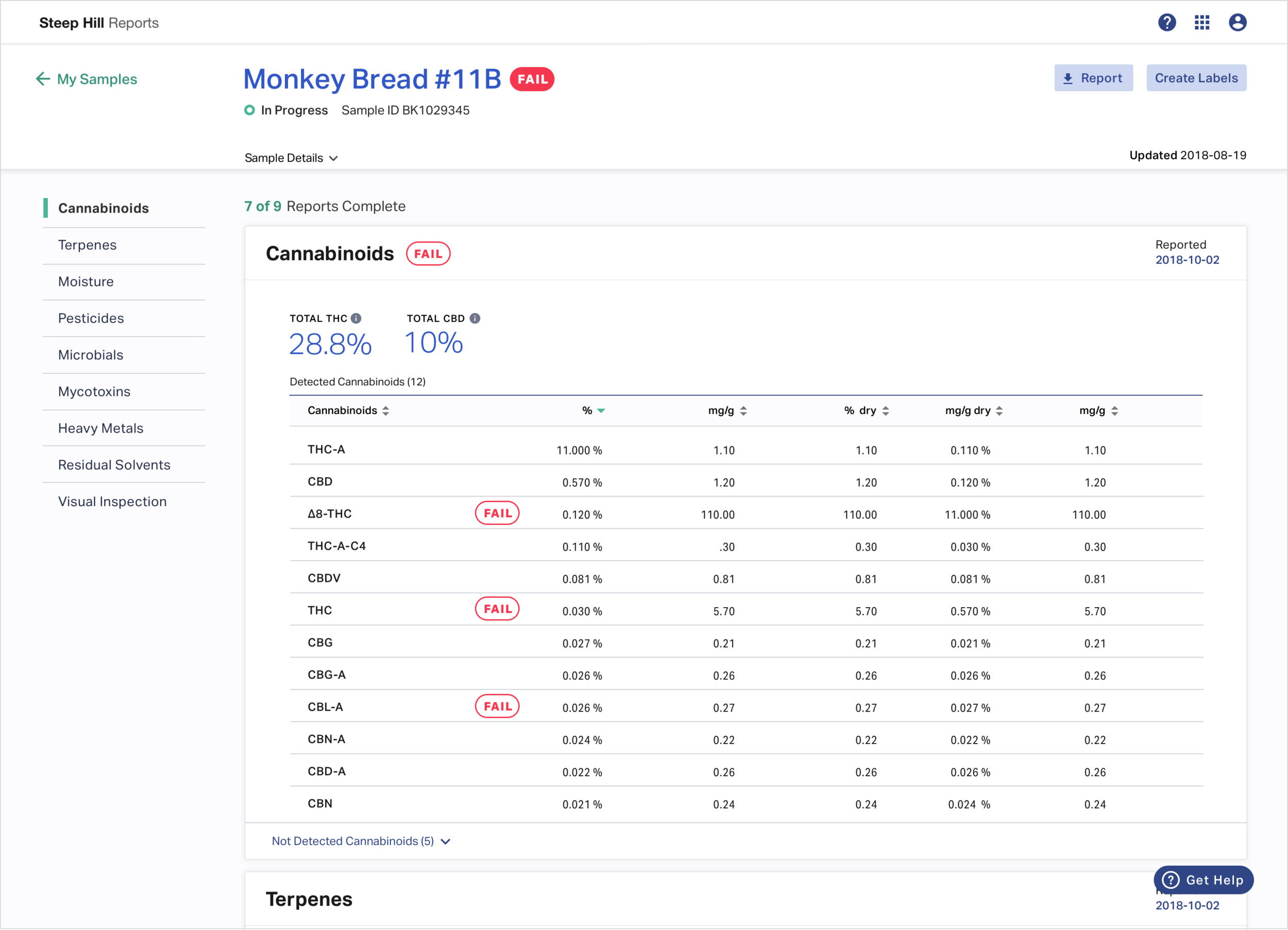
Clean and useful
Improved customer experience
Improved customer experience with a chatbot integration that included pre-determined responses to common questions reducing the work load of the CX team and improved overall response time for users.
The addition of a testing focused FAQ puts answers to common questions at the customers fingertips.
Accessible and cohesive
Customers can access their test results online (mobile or PC) anywhere.
Flexible data
Each test result includes multiple units of measurement to satisfy different user types. The data can be also be sorted to fulfill individual needs.
Data table best practices
Applied best practices, including display density, data hierarchy, and overall visual treatment, to create clear and scannable results.
Reduction in cognitive overload
Only relevant information is included in the sample header. All other details are rolled up into a ‘sample details’ section. Not detected analytes are also rolled up, allowing the user to choose when and how much information they want to see.
Changing units on mobile
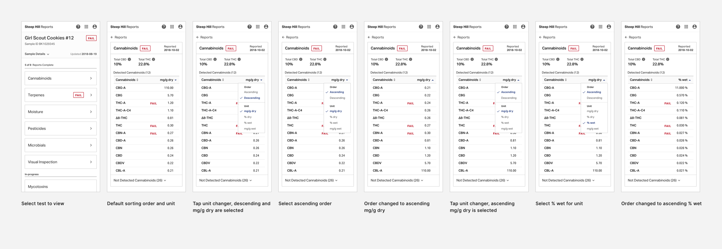
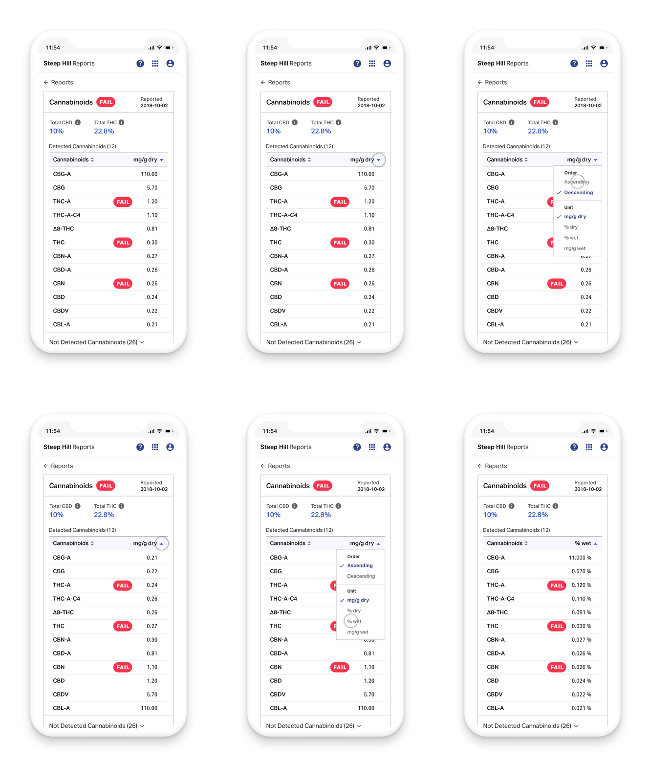
Mobile-friendly data
Units and column sorting
An interaction that combines sort by and unit changing create a mobile experience that accommodates all of the data and functionality of the desktop experience.
Measuring success
| Business Goal | Metrics | Success Criteria | Rational | Output |
|---|---|---|---|---|
| Digitize Industry | Corporate Investment into Initiative | Total number of customers who have adopted the platform | 80% | Platform |
| " | " | Daily Active Users | 25% | Daily Notifications for alerts on test results |
| " | " | Weekly Active Users | 50% | Weekly Notifications for alerts on test results |
| " | " | Monthly Active Users | 80% | Monthly Notifications for alerts on test results |
| On-Demand Access | All of our customers should be able to take business decisions by logging into the web app through their mobile device | Daily Active Users Mobile Traffic | Increase by 50% | Responsive framework for web app |
| " | " | Mobile users entered a Sample Report | Increase by 80% | " |
| " | " | Bounce rate of mobile users on a report | Decrease by 30% | " |
| Clear Actions from Data | Reduce the wait that the cutomers would experience due to a lack of aggregation of the data set | Time to business decision | Instantaneous | Finalized Pass/Fail Indicators |
| Customer Experience | Increase NPS score | Reduce time for response | 5 minute reduction in hold time | Chat bot (Zendesk) |
| " | Increase operational efficiency; decrease operational costs; increase employee satisfaction | Reduce workload | 5 minute reduction in total ticket time | Chat bot & FAQs |
| " | " | Reduce customer service tickets, specifically focusing on status | 25% reduction in service tickets overall, 70% reduction in status tickets | Chat bot & FAQs, Pass/Fail Indicators |

Conclusion
What I learned
Collaboration was key to this product’s success. I learned how to work with all different types of people and departments and bring their perspective in when it made sense and balance their expectations for involvement in design. Their collaboration was critical to our success when we did not have opportunities to speak with users.
What I would do next
There were a lot of areas we still wanted to explore. In particular, leveraging our genetics team to identify what data may be useful in predicting the quality of products and integrating that into our platform. We had to park a lot of our concepts and focus on being iterative and obtainable in a short amount of time.